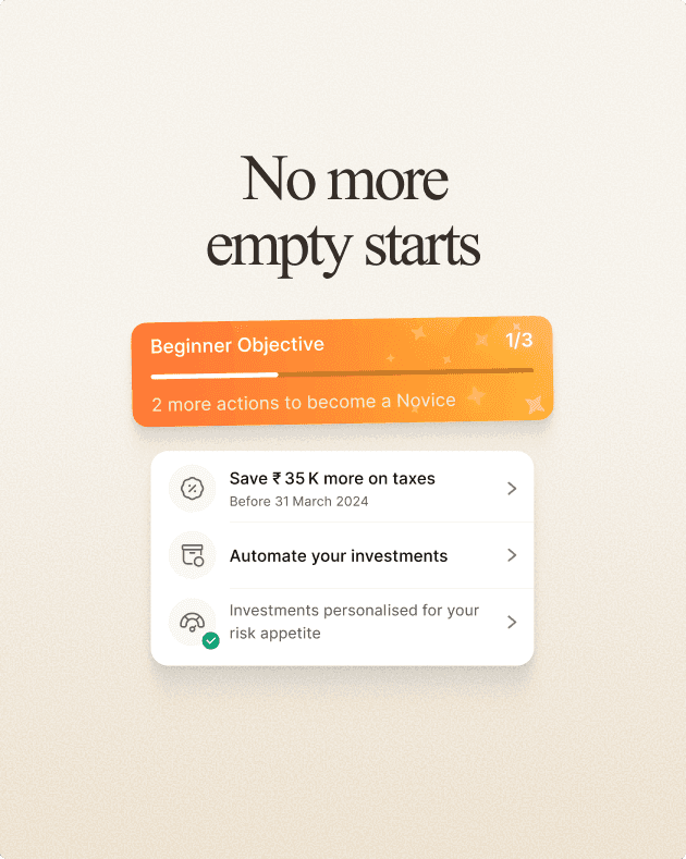
Tag
Concept, Product, Mobile
Date
Jun 2024
Context
This exploration was a creative detour while working on the Goal Dashboard for the Scripbox app. I was exploring ideas to visualise a user’s financial goal, things like current progress, target and the amount by which it is off-track.
Inspiration
During this phase, I got inspired by level gauges, those tools used to check if a surface is flat. It made me think: what if the same concept could show how far a goal is off-track.

Level gauge inspiration
Visualising
I started iterating with a flat shape, but the layout felt too rigid. As I kept iterating, a circular arc started to feel more balanced and dynamic. The final iteration ended up somewhere between a speedometer and a level gauge.

Initial sketch iteration
Final sketch iteration
The middle represents the ideal on-track state.
Off-track deviation is highlighted.
Dotted line shows the current goal value.

Final sketch iteration
Final Design
Since this was purely a concept exploration, I gave myself full creative freedom and designed it in dark mode — it helped the visual metaphor stand out and gave the screen more contrast.
I used bold red to highlight the off-track state, making it feel urgent and nudging users to take action.

Final design - Off-track state
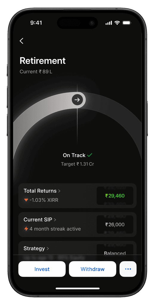
Final design - On-track State
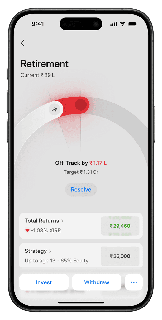
Final design - Off-track State (Light Mode)
Response
I shared a short animated video of the final design with the client and on X/Twitter and received positive engagement and feedback.

Despite the positive response, the design didn’t make it to production. It was simply too complex of a representation for the client audience base and did not check all the functional boxes.